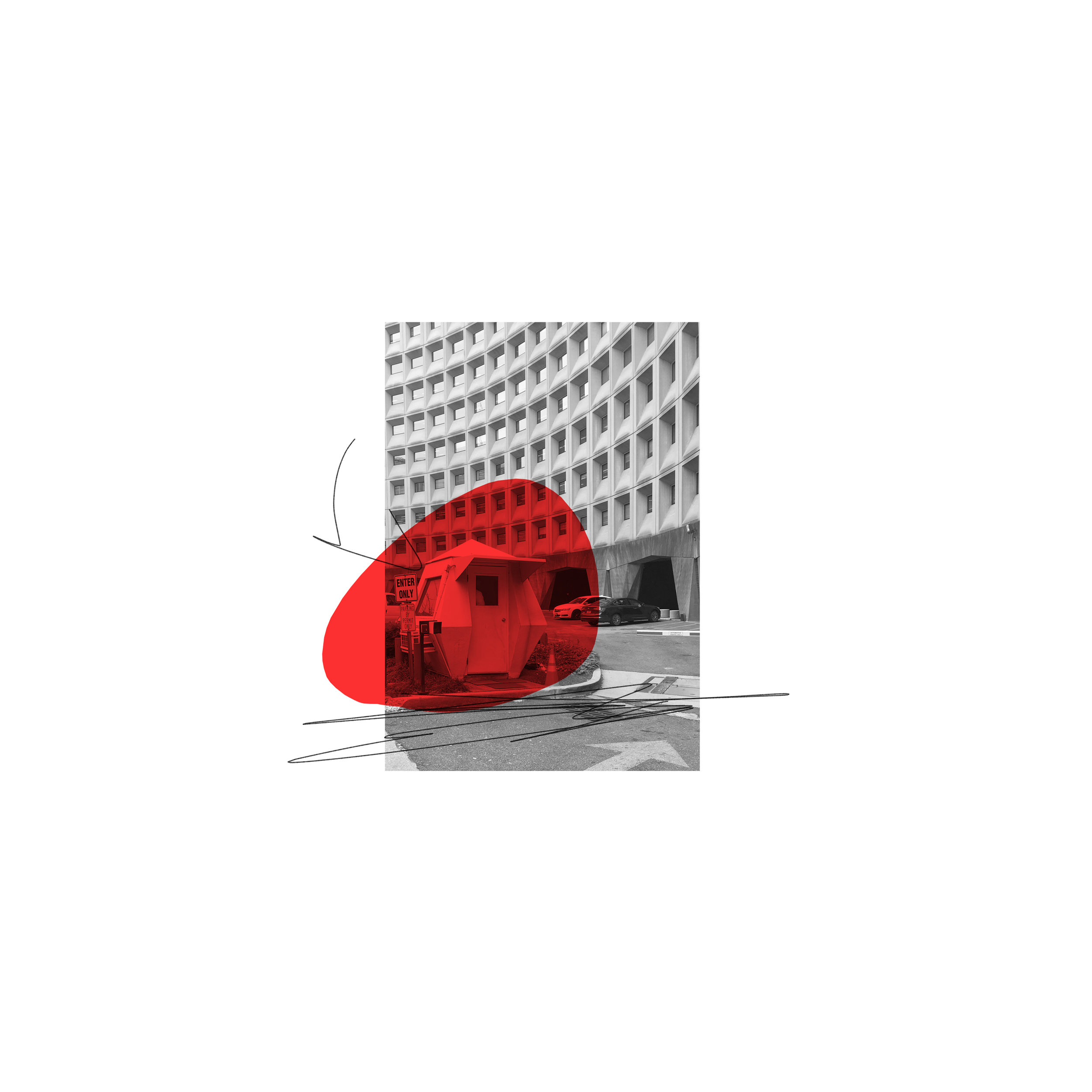
Body Talk B-sides

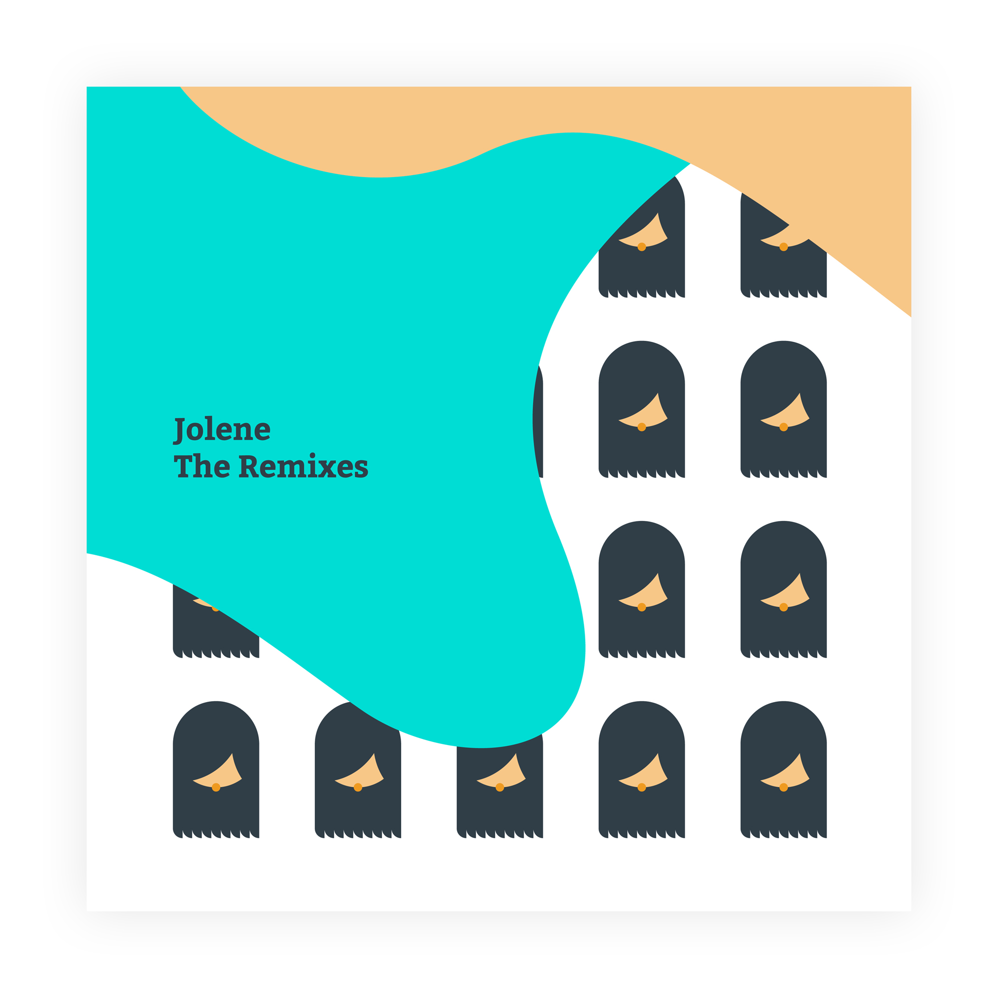
"Jolene" The Remixes
Wishful Thinking

Moontaanz

MAD Branding →
MAD is Making a Difference, a community development organization based in South East DC. They were founded in 2017 by Andre Wonson, a fellow at Changing Perceptions, a nonprofit that works with individuals coming out of incarceration to develop entrepreneurship.
Branding Option 1
Andre likes to tell the MAD origin story using three images.
First is the bumpy road.
This represents Andre's youth in the South East. He went through some tough experiences, and through that hardship he found himself incarcerated at a young age.
Next are the moon and stars.
After Andre had served his term he wanted to invest in the youth of his community. He wanted to show them that despite the bumpy road you can still shoot for the moon, and if you fall short you will be amongst the stars.
Lastly is the water.
Andre believes deeply in the potential of the youth in the South East, but he knows he can only lead them to water. He can't make them drink. They have to choose to believe in themselves just as Andre chose to believe in himself. The ship represents the continueing journey.
For the first logo option, I chose a star combined with a bold slab serif. The star is lifted from Andre's illustrated origin story for MAD. It represents hope while giving a slight nod to the stars in the DC flag, a point of pride for DC natives. The star also acts as an asterisk to signal to the reader that "MaD" is transforming anger. The typeface is Bitter, a free download (key for an organization with limited budget) that is designed to work well on screens and paper. It is rendered bold and 100% black to convey strength and steadfastness.

Option 1 Logo

MAD's first initiative is the establishment of a Riversmart landscaping project that specializes in rain garden installations. The Landscaping logo is a simple evolution of the organization logo. A blue to green gradient is used on the star to represent rainfall and plant growth.
Option 1 Landscaping Logo

Option 1 Colors
A practical branding challenge for MAD is that they are a small organization, with minimal web presence, and diverse dreams. Andre's vision for MAD is to be a flexible, multifaceted organization with many different projects going at once: landscaping, real estate, construction, youth center, etc. To compensate for this, the branding system must be both organic enough to grow with the organization, while also simple enough for a small business with no marketing team to wield the brand effectively. Thus the mark, colors, and typeface will be consistent across all the various projects. This will make it easy for Andre to use the logo system, and through consistency the brand will gain recognition.
The organization's short-term needs are business cards for the landscaping project, and a flyer explaining what MAD is. Combine these two inexpensive pieces of collateral and a potential customer will be able to grasp the overall vision for MAD and understand the practical sales pitch for the landscaping project.
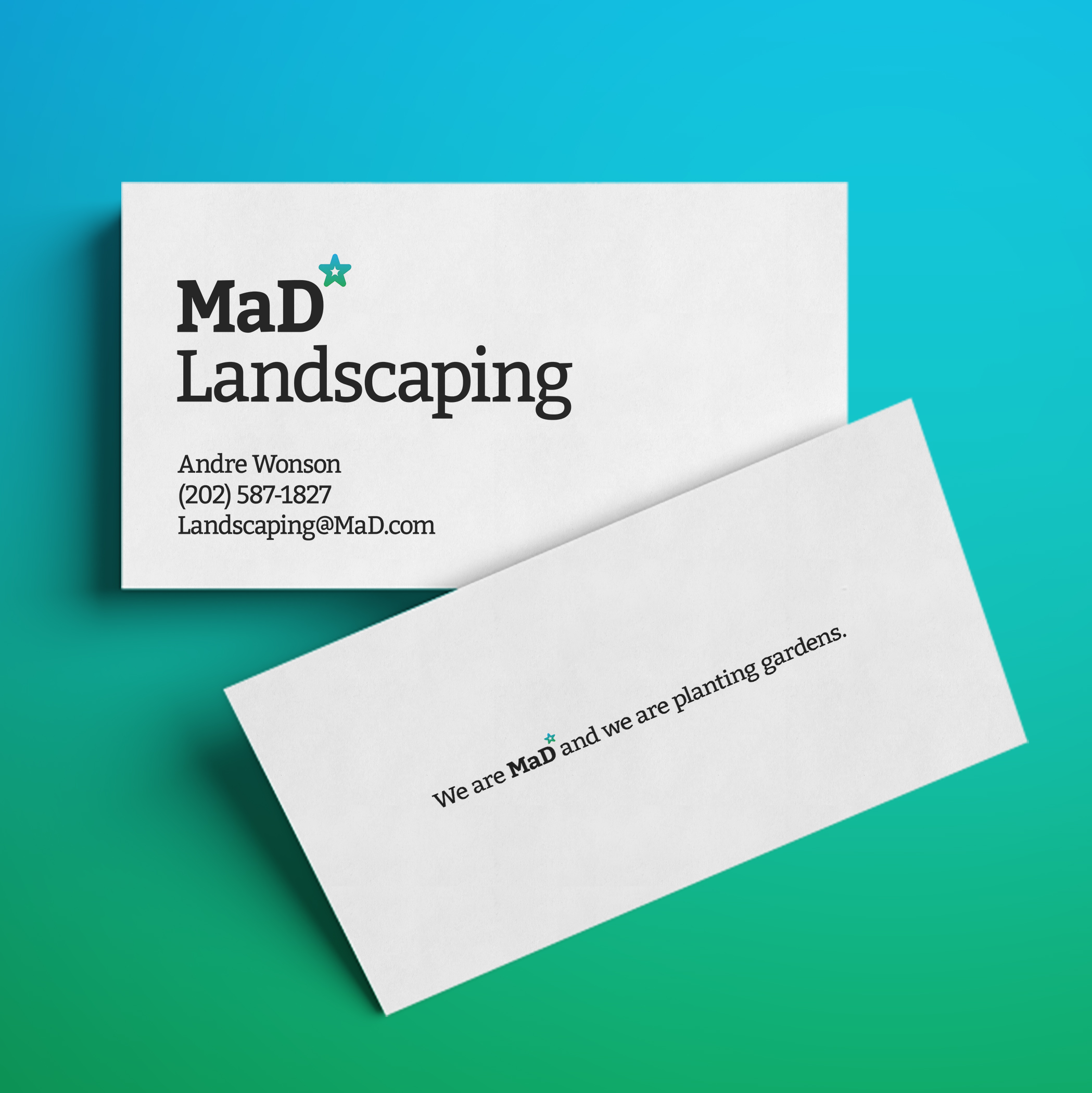
Option 1 Landscaping Business Card
I wrote the tagline to play off the organizations acronym to be adaptable to new business ventures, to convey the spirit of the founder, and to distance the brand from any negative connotations of the word "mad."

Option 1 Flyer and Landscaping Business Cards
T-shirts round out the practical and easy-to-implement branding collateral.
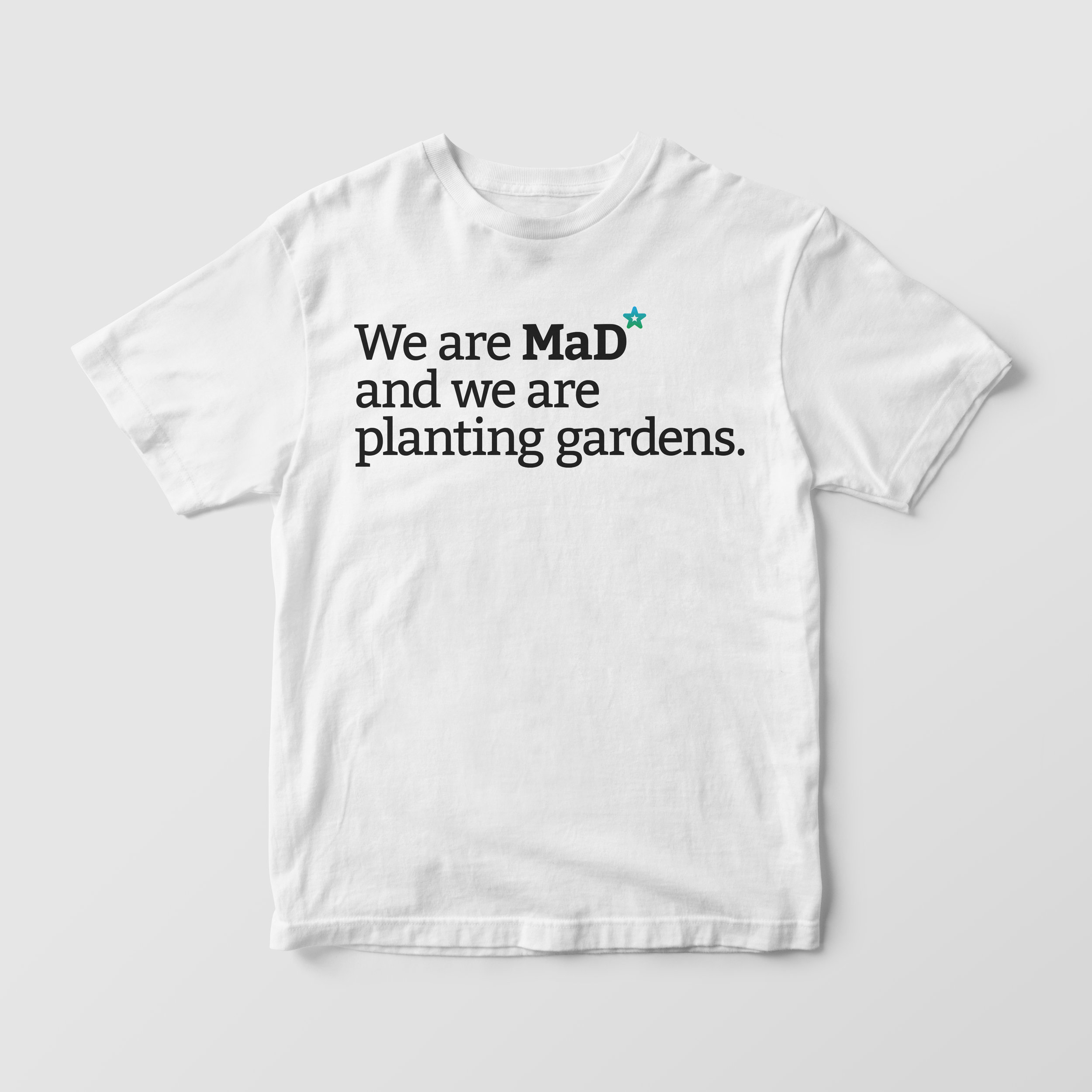
Option 1 T-shirt
Currently Andre spends most of his time on the landscaping project, but in the long term he hopes to diversify into construction, real estate, and anything else useful to the community. Below are examples of logos and taglines that illustrate the flexibility of the option 1 logo system.
Option 1 Logo System
Branding Option 2
Option 2 is all about embodying the spirit of MAD's founder. Andre did not grow up in a life of privilege, but in spite of this he is a force of optimism. This notion is alluded to by turning the "D" in MAD on it's side and adding a period above it to create a winking smiley face. In this way "mad" is transformed from anger to joy, just as Andre has transformed his hardship into joy. I chose Courier as the typeface mostly for the fact that it is monospaced. This quality allows room to rotate the "D", and it conveys a machined coldness that is a perfect set up to undermine with a playful twist. The color is pulled from the red in the DC flag.

Option 2 Logo
Much like option 1, the landscaping logo for option 2 is a simple evolution of the organization logo. I chose green because of the obvious association with nature, and for the visual vibration caused when the dark green is combined with the bright red of the organization logo

Option 2 Landscaping Logo

Option 2 Colors
Like in option 1, the collateral for option 2 is designed to be inexpensive, easy to implement, and give Andre devices for explaining his vision. Thus the background of the business card features river oats, a plant native to the DC area and one that Andre uses often in his landscaping work.

Option 2 Landscaping Business Card
The flyer for option 2 is designed as a letter from Andre to his customer. In it he can tell his story, explain how MAD came to be, and talk about the landscaping project.

Option 2 Flyer and Landscaping Business Cards

Option 2 T-shirt
Option 2 Logo System
Mindfulness

Bulbous v3

HAPPY

Dear...

It's a Test

Line, Dark Purple, Not Smooth
Gooey Poster
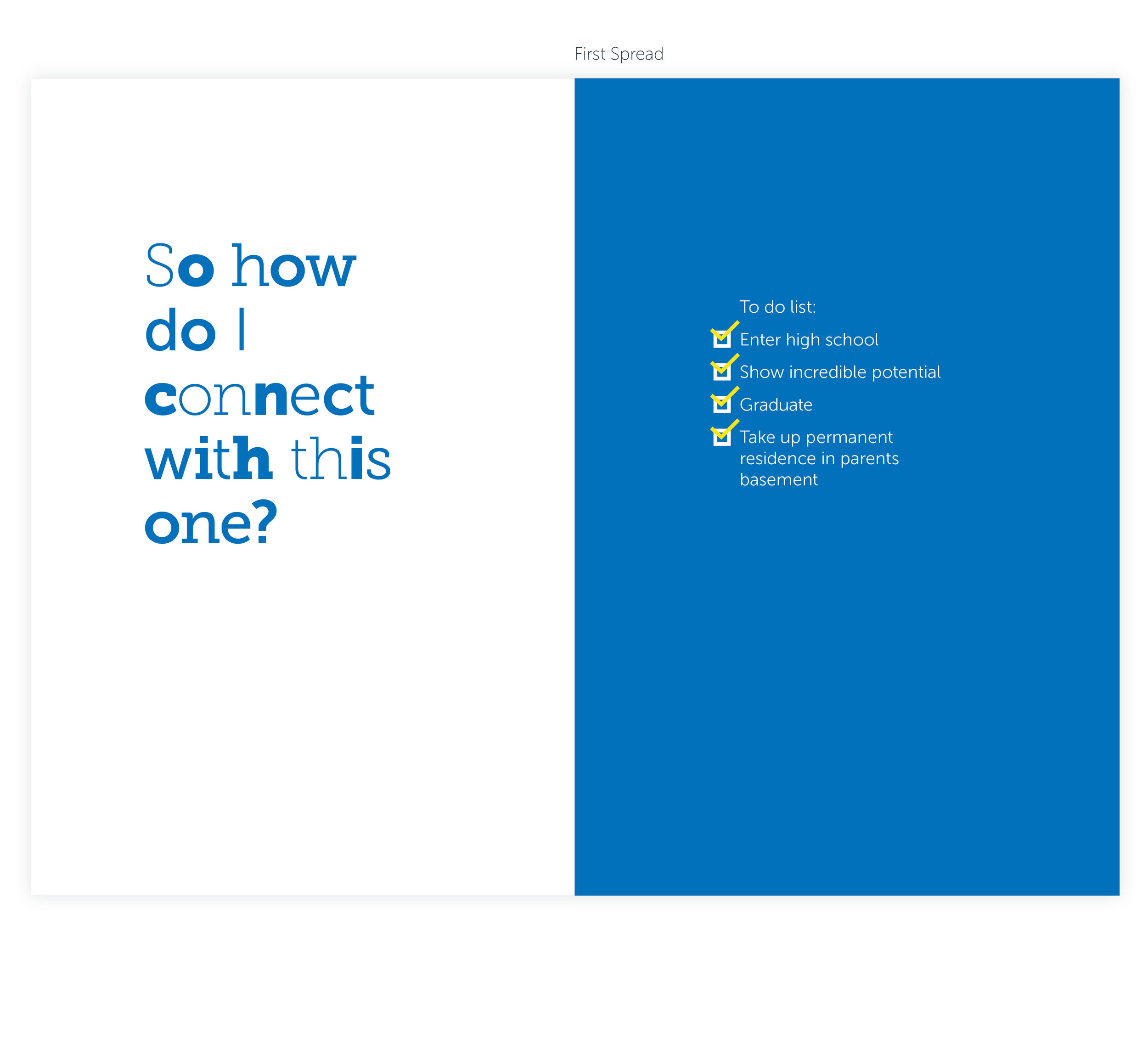
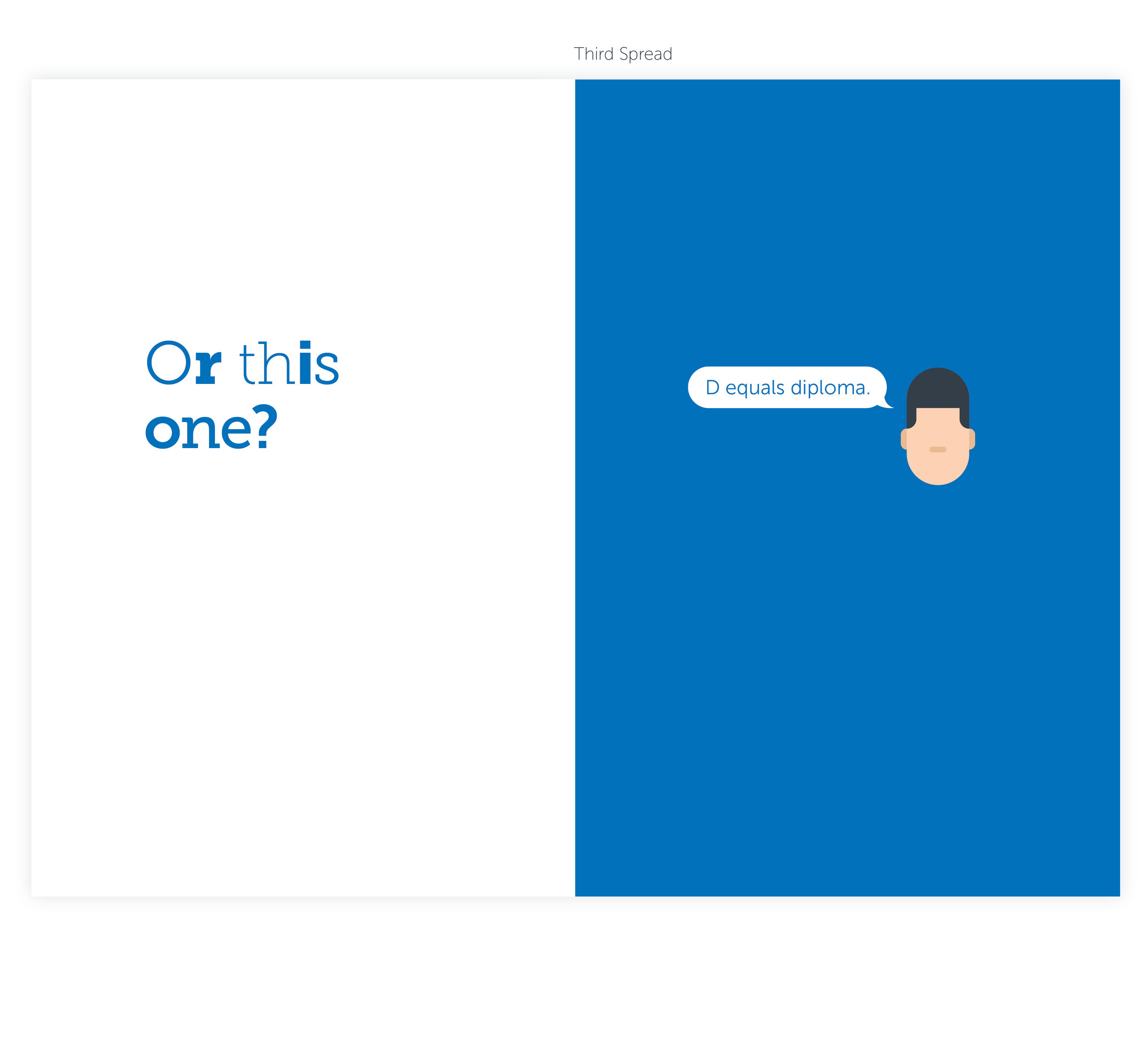
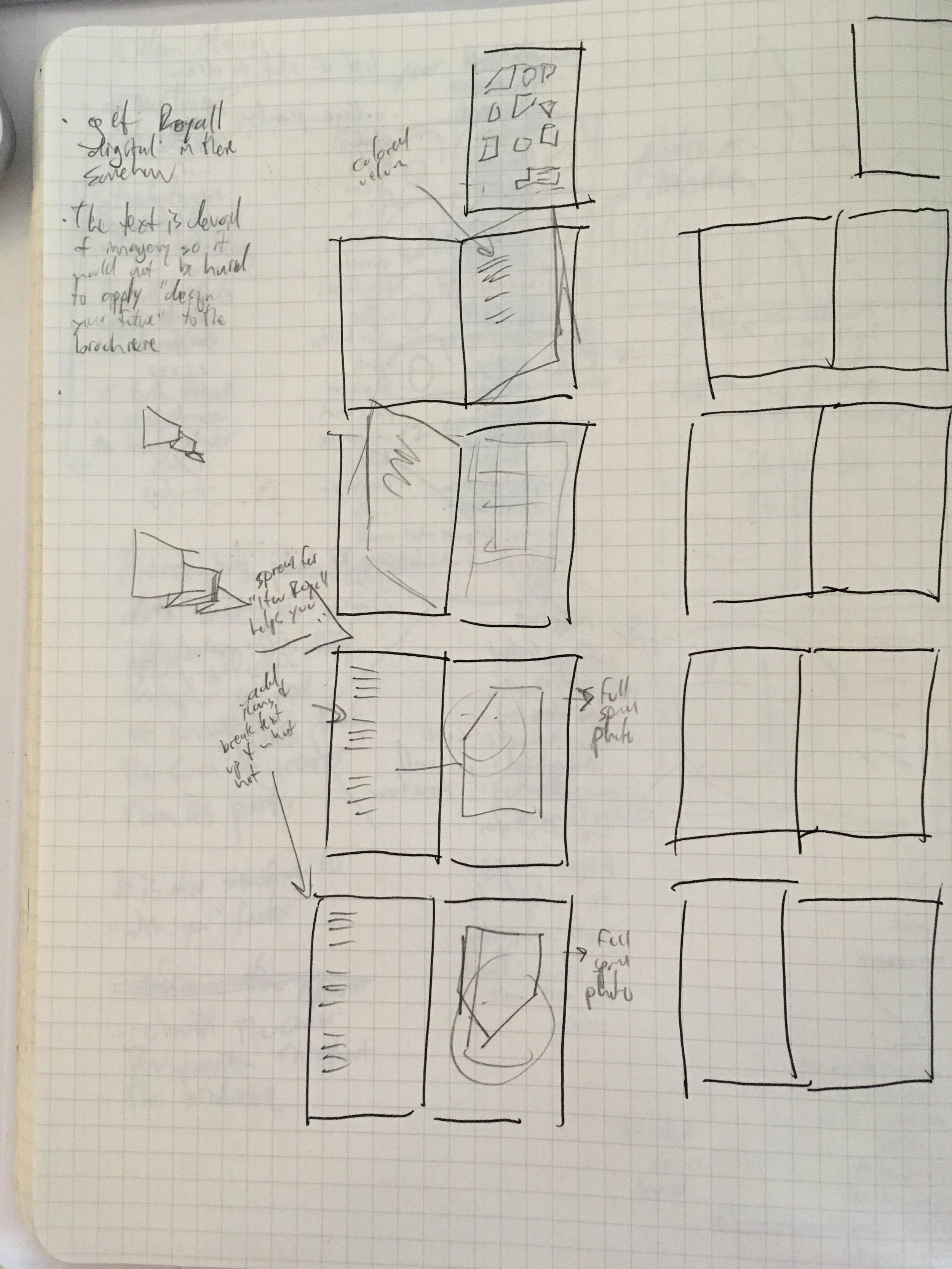
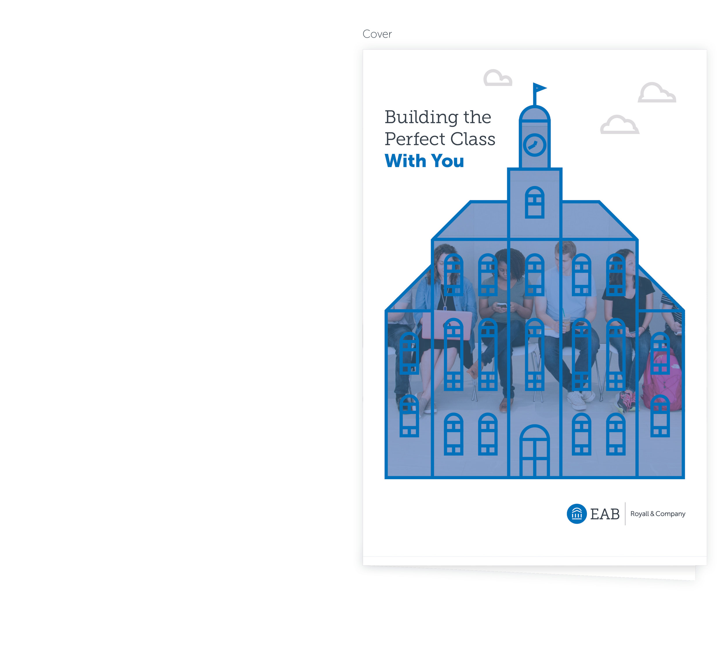
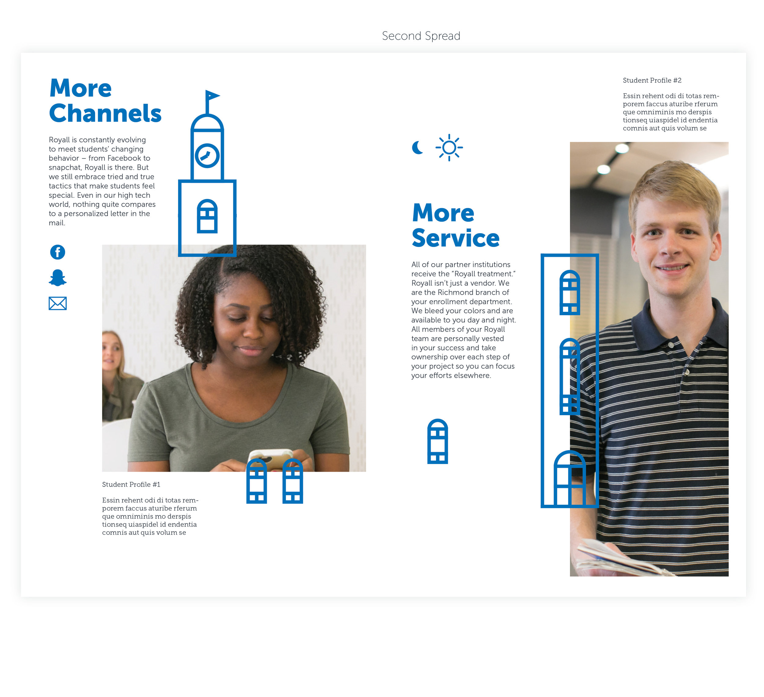
Royall Brochure Rough Drafts
Comp 1 Sketches
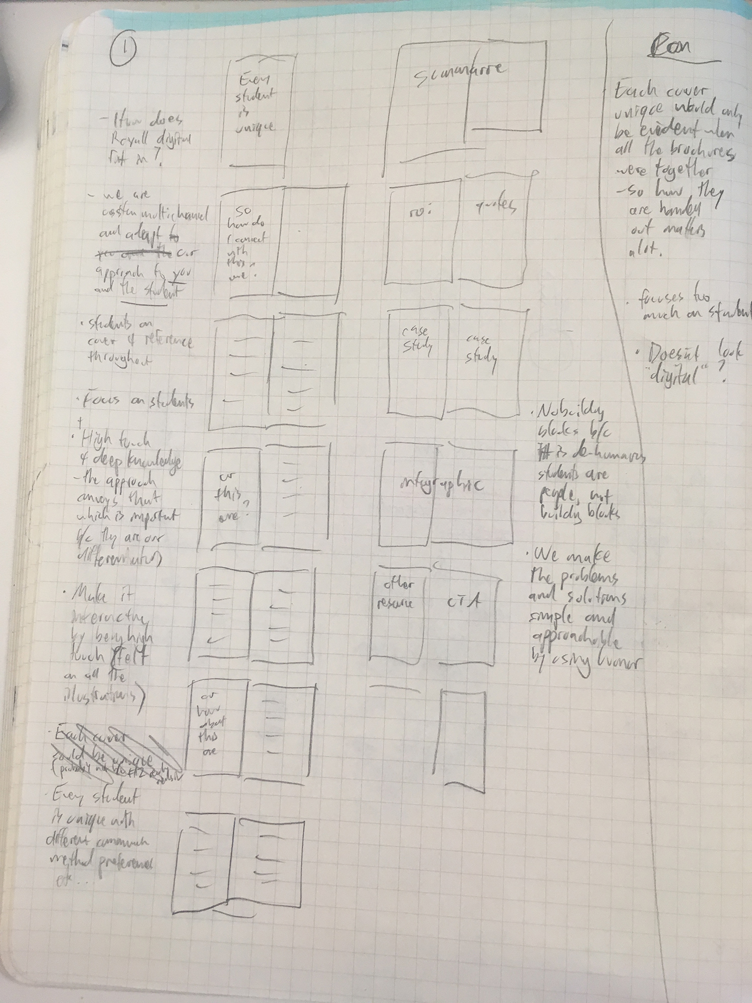

Comp 1 Proof of Concept


Comp 2 Sketches

Comp 2 Proof of Concept


Comp 3 Sketches


Comp 3 Proof of Concept (in progress)
